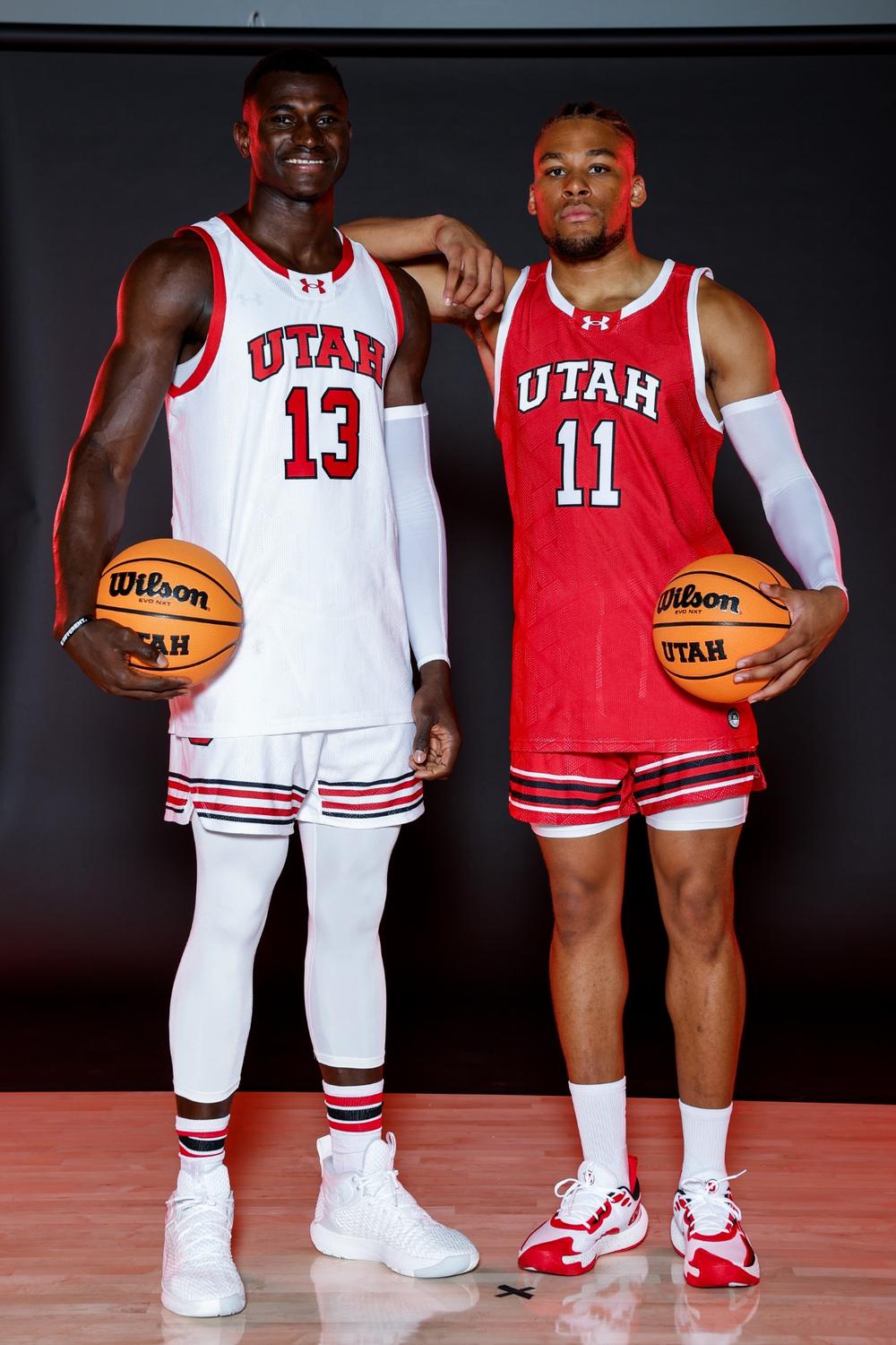
New Bball Unis are Clean AF
Welcome to Ute Hub › Forums › Utah Utes Sports › Basketball (Men) › New Bball Unis are Clean AF
- This topic has 11 replies, 11 voices, and was last updated 1 year, 6 months ago by
chinngiskhaan.
-
AuthorPosts
-
-
 GameForAnyFussParticipant
For the 3 other people who care about basketball: Here’s our drip this year. Thoughts?
-
chinngiskhaan
ParticipantWould be better with just a red outline on bottom like the tops.
-
 cj13Participant
I like the stripes on the bottom. It looks good and it keeps the unis from being as basic as possible but still keeps it clean
-
-
 bopahullParticipant
Simple and clean. I like the stripes. I think the team might do OK too.
-
 The Miami UteParticipant
I have basketball season tickets so I guess I’m the third man. Uniforms are just OK in my view. I personally like the throwbacks best.
-
 highlandute7Participant
I like them but I would rather see the Drum and Feather or interlocking U’s on the neckline instead of the UA logo.
-
 Tony (admin)Keymaster
The uniforms are “clean American Fork?”
-
 Ute DubParticipant
I think he meant Abercrombie Fitch
-
-
 MDUteParticipant
Love the new unis! Especially considering how awful the last ones were. The last MBB unis were so embarrassing it was almost a good thing nobody came out to watch the team play.
That said, I agree it would’ve been a nice touch to add the D&F in. A couple of places it would’ve looked good IMO are either on the back of the jerseys just above the number with a small D&F logo. Or I think it would’ve looked better on the front/center of the waistband of the shorts where they went with a Block U. Lastly, I think the D&F would’ve looked better in the V-neck spot of the jersey vs the UA logo and they could’ve moved the UA logo to the side top of the jersey just above UTAH where they typically put their UA logos on college team jerseys.
But aside from being nitpicky about no D&F, these are truly a MAJOR step up and LONG overdue! Go Utes!!
-
 RustyShacklefordParticipant
I hate the short shorts the players wear these days. I don’t need Fab 5 level length but how about right above the knee!
-
chinngiskhaan
ParticipantNo reason for all that extra fabric. These shorts are much more practical. I grew up in the baggy shorts era and after playing in these shorter style shorts, I can say they are far superior for performance.
Unless seeing man-thighs makes you weak in the knees or somehow offends you, there is no reason for wearing baggier shorts than this when competing in athletics.
-
-
 CharlieParticipant
My guess the players have a lot of input into uniforms. They wear them, they should make these kind of choices, all within reason. If someone wants to dress the fans I think there could be several great suggestions.
-
-
AuthorPosts
- You must be logged in to reply to this topic.

