D&F, block U, or UU
Welcome to Ute Hub › Forums › Utah Utes Sports › Football › D&F, block U, or UU
- This topic has 14 replies, 13 voices, and was last updated 3 years, 3 months ago by
lgt4141.
-
AuthorPosts
-
-
 ALUFParticipant
Which logo do you prefer? I think I still prefer the D&F but that’s because I grew up on that
Just want to know what others think
-
FtheY
ParticipantLike them all, of course.
1. interlocking U and it’s not even close
2. drum and feather (classic)
3. Block u (least favorite)
I realize that’s not the traditional favorite and will likely get downvoted. But on apparel, the interlocking U is much cleaner and less busy. Like the drum and feather too when it’s not oversized.
And the interlocking U at midfield is so much better than the block U now. Stoked that got upgraded. But hey, modern and minimal is more my style anyway.
-
-
Redblood
Participant1. Drum and feather
2. Block U
3. Interlocking U’s (don’t like at all) -
12PAC
ParticipantInterlocking U is the by far the best. Clean, classic, and completely unique to the U of U.
-
 UteThunderParticipant
Completely unique to the U of U?
Oregon, Oklahoma, Colorado, Indiana, Houston, Notre Dame, USC, Bowling Green, Baylor, Auburn, and Kentucky all have logos either past or present which use interlocking letters like the interlocking U’s. It is anything but unique.
-
-
Carterdalby
Participant1. D&F
2. Block U3. Interlocking U
-
 noneyadbParticipant
1- UU with 🌹😁
2- UU
3- D&F
-
FtheY
ParticipantWell played.
-
-
 ProudUteParticipant
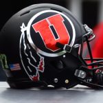
I am a drum and feather guy 100%
-
PhiladelphiaUte
ParticipantI love the Drum & Feather best of all, but I don’t think that logo would look as sharp as the Interlocking UU does on our midfield. I also think the Interlocking UU looks better on our helmets for our throwback “Ohio St” uniforms ONLY! So the Interlocking UU comes in as a VERY close 2nd to the D&F.
As for the Block U: I like it on the side of the mountain just north of the Avenues. But everywhere else….hate it!
-
 CBParticipant
1. UU
Close 2nd D&F -
 UteThunderParticipant
D & F is by far the best.
The block U is nice.
The interlocking U’s look cheap/generic. Not a fan of those at all. When buying apparel, the interlocking U’s is right there with Swoop, meaning I go out of my way to not by stuff with either one on it.
-
 rbmw263Participant
I think the D/F is a stronger brand than the UU. Its more memorable. The UU just kind of blends in with a littany of logos. Its a clean look but its more bland. The D/F pops. It will always be my favorite until it is inevitably phased out…..
Ultimately my favorite logo is the one recruits like. Whatever the kids are into drives the program, so ill go with that.
-
lgt4141
ParticipantDrum and feather all the way. It is a unique logo that stands out from the other ones. Personally I would have liked to have seen the drum and feather on the Rose Bowl because it feels more like Utah’s brand than the interlocking U’s.
The Rose Bowl uniforms did look great!
-
-
AuthorPosts
- You must be logged in to reply to this topic.
