Interlocking U's v Drum and Feather
Welcome to Ute Hub › Forums › Utah Utes Sports › Football › Interlocking U's v Drum and Feather
- This topic has 14 replies, 13 voices, and was last updated 9 years, 6 months ago by
 FountainofUte.
-
AuthorPosts
-
-
 rbmw263Participant
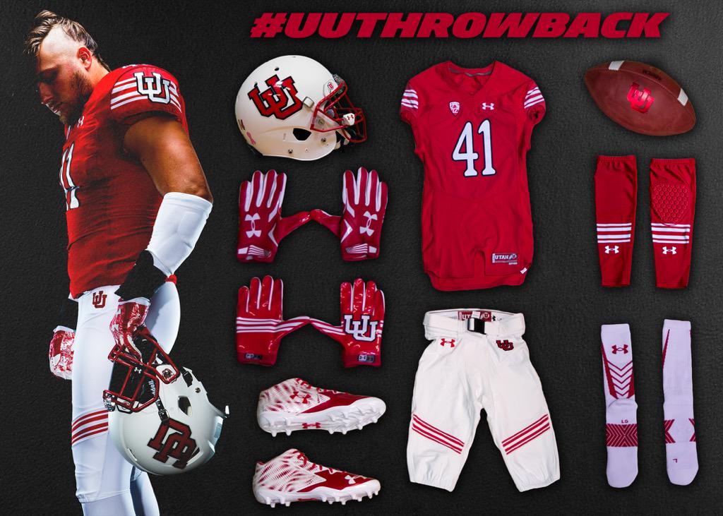
There seems to be a growing sentiment that we should go to the interlocking U’s full time among some portion of the fan base. While I agree it looks nice, I think the once the novelty was worn off, it would be a VERY plain logo. Most importantly, I really dont think it would be one that catches recruits eyes. No recruit is looking at that and saying, “wow, thats a great logo”. Not going to be one to stick out in their minds. It should be our secondary logo, but as a primary there is really just nothing special or unique about it I like.
If you took these throwback uniforms after this week, and made them the permanent uni, but threw a D&F decal on the helmet, they would be the best uniforms in Football imo. The D&F pops, it stands out, its beautiful. Its special to me, and I would be devastated to see it go. Anyways, was just curious on your guys thoughts.
-
 javadaveParticipant
-
 BrettskiParticipant
I’m in the camp of liking both 🙂 Let’s keep both and use both. However, I would prefer to have the throwback uniform (non helmet) at all times. No more mountains…
-
 Ute BcParticipant
Why not use both and alternate? I like both logos and think we should use them both. Similar to what Oregon does with its’ “O” logo and then the feathers and duck.
-
 GadValleyUteParticipant
I’m a both man. When I arrived on campus both were still in use. I wasn’t terribly fond of interlocking U’s as an 18 year old, but since D&F and single Block U have come to dominate. I think interlocking has a place and I hope we find a way to use all 3 or drop the single block U. The single block U has been way less cool since ESPN U launched.
Lots of schools use multiple logos. Very few have a monolithic logo. Michigan, Cal, and Bama spring to mind, but plenty more SC, ASU, UT, LSU, Florida, Ohio State run out different symbols and logos. -
 Mr ChainsawParticipant
I like the throwbacks a lot, but I really dislike the font used for the numbers. It reminds me of Comic Sans, except with serif.
-
 Extra MediumParticipant
we have a local license with clc. the interlocking u’s are reserved for big boy apparel companies. the little local guys like ourselves can’t touch them. they have become like Oregon’s “O” for nike for Under Armor. I have over 20 designs using the interlocking U that we were forced to pull because we don’t have permission to use them. it’s some bulls**t! I really wish the U would tell CLC to eat a fat one and open it up to the companies that are passionate about the U and not some Baltimore apparel company.
-
 UtemachineParticipant
Scott, what do you do in the apparel industry?
-
-
 Extra MediumParticipant
I have a various t-shirt lines and a screen print shop downtown. we do a lot of printing for schools, the u, family reunions, and businesses. our websites are offsideapparel.com, runningredshirts.com, utahscreenprinting.com, and we’re working on tshirtsnob.com, trueblueapparel.com, saltlakeclothing.com, and a few others.
-
 Wilson’s MustacheParticipant
If you took these throwback uniforms after this week, and made them the permanent uni, but threw a D&F decal on the helmet, they would be the best uniforms in Football imo
This
-
Anonymous
InactiveThe throw back helmets should be thrown out. I don’t care if they save paying royalties to the Ute Tribe for one game.
-
 Astute UteParticipant
My opinion drum and feather is the uniform. Nothing comes close
-
 EUteParticipant
The Drum & Feather is iconic. All the various uni combos and color variations are fine, but the D&F should be the one constant, instantly recognizable icon that says “we are Utah”. It is the perfect symbol of the school, the state, and the people whose namesake we carry and honor. I would be really sad if it were ever abandoned.
-
 FountainofUteParticipant
Put me down as a “both” fan, too. A red helmet interlocking version with an all white uni would look sweet!
-
 FountainofUteParticipant
…As for the Block U, it’s one of the oldest surviving icons of the school. If it’s still good for Mount Van Cott, it’s good enough for me. I think a BU helmet would look cool. A plain white BU on a red helmet.
-
-
AuthorPosts
- You must be logged in to reply to this topic.
