Next:
Mississippi Valley State @  Utah
ESPN+

Let’s get rid of the obnoxious long links!

Welcome Cyclones Fans! Forums Ute Hub Site Let’s get rid of the obnoxious long links!

Viewing 4 reply threads
  • Author
    Posts
    • #128178
      8
      Tony (admin)
      Keymaster

      One way to clean up the user experience here is to fully use the link dialog here to post clean links.  Many of the links posted here are obnoxiously long and can sometimes cause display problems because there are so many characters the link breaks the layout, or goes out of the content area etc.   Plus the long links are just damn hard to read.  Here’s an example:

      Please use the link dialog:

      You enter the link in the first field, then the LINK TEXT in the 2nd field. Make the link text a description of what the link is:
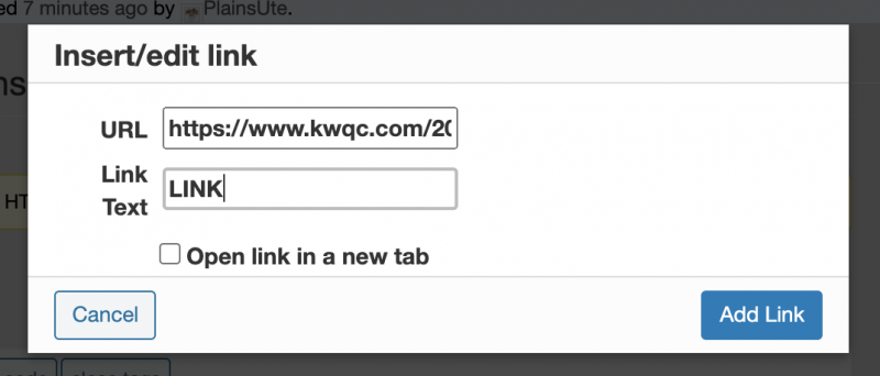
      By doing the above, there is a short clickable link text which looks nice and clean!

      MOBILE

      In the iOS/Android app, the link dialog is below the text area on the left side, and looks like a chain link.

      GO UTES

    • #128190
      4
      UteBacker
      Moderator
    • #128191
      2

      Thanks, Tony!

    • #128197
      highlandute7
      Participant

      Would be nice if the said link would open in a new window. Clicked on the Test Link from UteBacker and it opened in the window I had up for Ute Hub. A new window would be better in my opinion.

      • #128199
        highlandute7
        Participant

        Not sure if you already fixed that Tony, but just clicked on it again and bam – new window. 🙂

        • #128201
          2
          Tony (admin)
          Keymaster

          ALL external links are supposed to open in a new window.  Not sure what happened your first time. 

    • #128206
      1
      Dallas
      Participant

      Test
      test

Viewing 4 reply threads
  • You must be logged in to reply to this topic.