I’ve spent a lot of time working on the new threaded view in the home page here at UteHub.com. After having that fairly nailed I decided to see if I can improve the regular forum views for mobile devices as well. I’m running a Samsung S5 and sometimes the avatars and usernames were whacked, the little links for reply-spam etc would bleed into the post, plus the formatting of the post replies was wonky. Still the site’s mobile layout was one BILLEEEEON times better than other Ute fan sites… But better isn’t good enough.

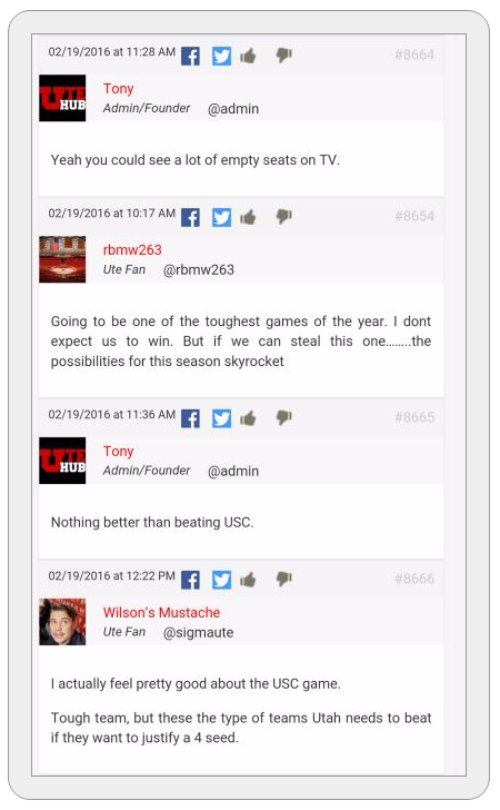
So the last couple of days I’ve worked on getting the regular forum posts looking better on smaller devices. Please check it out on your various devices and let me know if it is easier to read and if there are any issues. The attached photo shows you an example of what it “should” look like, though varying devices and browsers may have small differences.
You may not see the updates if your browser has cached the site. Clear your device’s cache/history to be sure to get the new updates.
GO UTES!